

Frankenstein
2019 | Editorial Design including all photographs, collages, and paintings by Bridgette Silva
UPDATE:
As a design student, I assembled these compositions with curiosity.
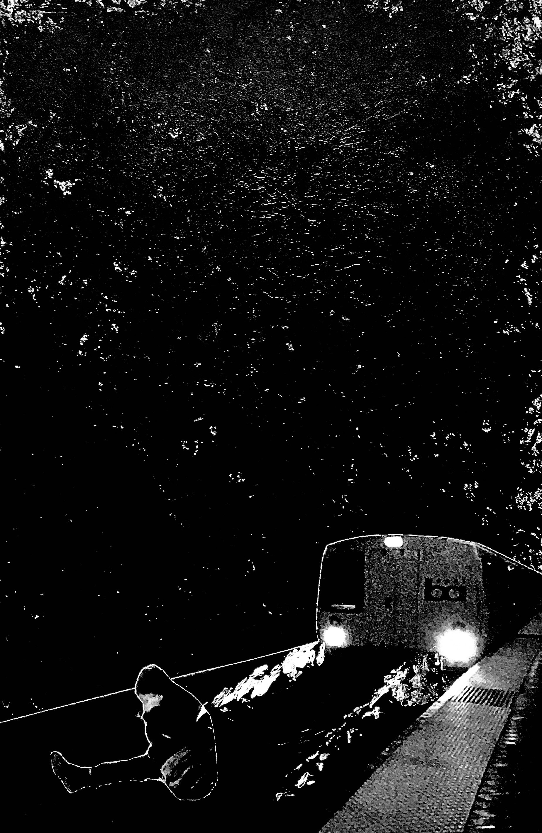
I want to take some time to understand the narrative that was told within the last chapter page that will be taken down as I don’t feel comfortable with the composition and would like to shift the perspective for a different outcome.
When creating the last chapter page of this design, I told my professor that the final chapter page did not make me feel comfortable, but it told the story of many lost souls who we’re suffering through homelessness. I asked her about the boudaries that it pushed within ethics, and if it was a composition I pursue. She pushed me to sit in the uncomfortableness as a designer and tell the story.
Post-Covid , this reality became more apparent as our homeless population increased. While yes, the last chapter of this re-design made me uncomfortable — I can see the outside perspective my professor was pushing me towards - a feeling to sit with in hopes of pushing our community to actively participate in rehabilitating the homeless population as our city heals from the effects of the pandemic.
Within my community service with St. Francis Center in Los Angeles, CA, I served the homeless in various ways: community feedings, hygiene care packages, blanket drives, etc. My work earned me a Certificate of Recognition for my Volunteer work issued by Tom LaBogne, Council Member 4th District from the City of Los Angeles in January of 2013. The work I did in my developmental years became the reason I held and pursued this project with so much attention to detail.it’s the reason why I would like to re-design the last chapter in hopes of showcasing the solution and not the problem while uplifting those in the community that serve as leaders in the future of San Francisco.
Book Redesign
The redesign of this book created an opportunity to showcase the story of San Francisco and the untold narrative of overlooked lost souls.

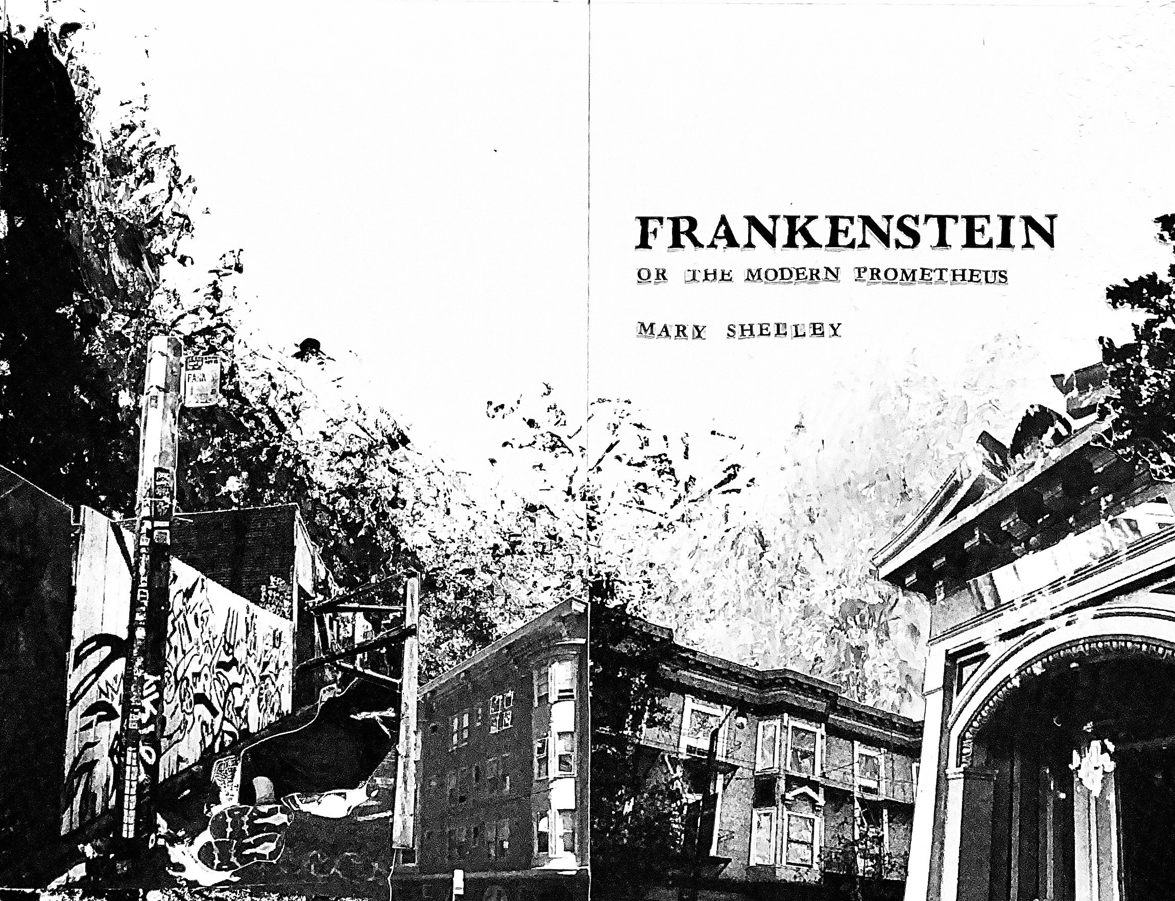
Frankenstein; or The Modern Prometheus Front Cover Book Redesign
Overview
In today’s day and age, we are often isolated within our busy worlds forgetting to take in our surroundings, always overlooking the people that make up these surroundings.
The recurring theme within the book showcases collaged chapter and letter pages, mixing photos of San Francisco’s wealthy and poverty-filled areas to create the sense of separation between both worlds.


Chapter Pages
Within every chapter page there is a collage including the homeless that roam San Francisco, usually left forgotten and overlooked.
The theme engages readers while captivating the story of San Francisco, bringing attention to the quick shift of clean streets to the ugly truth that is homelessness, poverty, and the hardships of San Francisco.

Composition Development
Major findings were discovered during the first round of collages:
Adding texture with acrylic paint
Paint splatters increase from light to dark through a series of greyscale backgrounds.
Paint splatters symbolize the transition of Victor Frankenstein’s character development from childhood to adulthood.
Adding a 1/2” border to every canvas was incorporated into the rest of the collages.
From analog to digital, collages were Photoshop to include more grain to represent the “grunge and distressed” look of the streets of San Francisco.


Letter Pages
The final iteration for the letter pages included complimentary elements from the chapter page compositions. To reduce waste and to add texture to the composition, left over scraps of paper from unused photos were used.
A clean blend of chaos and order was represented through hand ripped pieces of paper that symbolize distress along with precisely cut pieces of scraps symolizing the order.
During the first round of iterations, the titles on letter pages were added digitally over a black background text block. The text was not in unison with the rest of the design due to its structured look.
After printing and reviewing several font sizes, I landed on hand cut 72pt black text over a lighter shade of scrap ripped paper to add contrast to the composition.
Paint Splatter
A series of paint splatters that increased from “white to black” became the base of every collage.
24x20 bristol boards were cut down to 7x10” boards to accommodate for the added 1/2” boarder for a final 6x9” canvas.
Some of the paint splatters lost value when going through the final digital editing process.
Nonetheless, the idea of using paint splatters to represent character development was still prominent in the final theme.


Fillers
At the end of every chapter, I discovered that the white space created a blunt stop that took away from the fluid visual of the book, the blunt stop was much like a widow at the end of a paragraph.
I created new paint splatters on tracing paper to scan in and add to the end of the chapter pages.

Editorial Design
Click through to view full book layout *
